Monday, 13 December 2010

Pitch Feedback Report

Group Members: Jake and Charlotte
Death Walkers

Our feed back from our presentation as a whole was:
Excellent Visuals
Easy to read
Multiple images/video

Delivery:
Clear, Confindent, Consistant

Idea:
Genre: zombie 
TV Footage 
Flickering of lights 
Suspence 
Penultimate Twist 

Planning/Logistics:
Clear target of audeince
Audeince Identified

Stengths:
Clear knowliodge of genre and convenions
Match idea was popular amongst the group

Weakness:
Is there enough content to fill 2 minutes

Areas to Improve:
Whats on TV
Flash of zombie reaction 
sillhoutte
Torch?
 

Tuesday, 30 November 2010

Audience Research - (Target Audience, User Ratings)

Audience Research: Who our film will be aimed at.

Dawn of The Dead
Males Under 18


28 Days Later
Males Under 18


Resident Evil
Males Under 18

As all 3 films I researched had a main target audience for the under 18 category (specifically male) therefore our target audience for our film will be the same, consequently making our horror film a 15.

* All information was discovered on www.imdb.com 


Thursday, 25 November 2010

The Walking Dead - Textual Analysis


The list of jobs that appear  during the opening sequence are:
Casting by . . .
Editor
Production designer
director of photography
Produced by
Executive producers
Written By
Directed By


In the picture above, red is the most dominant colour. It is effective in creating a sense of danger and is a good colour to use in a zombie film, as it is associated also, with blood and gore. Black is also a dominant colour, it effectively brings out the colour red making it appear deeper and creates a sense foreboding. In the opening sequence "Dead" appears larger than the rest, this is very eye catching, as it draws the viewer in.

Dawn Of The Dead - Textual Analysis


The list of jobs that appear  during the opening sequence are:
Casting By . . .
Music By . . .
Music Supervisor
special effect make up 
costume designer
 co producer 
editor 
production designer 
director of photography
executive producers 
produced by
Screen play by
Directed By

I thought that the visual effects were quite effective. They stood out against the black background and was very clear to read. The title that appeared during the opening sequence looked like they  were drops of blood being blown away which i thought was compelling  to watch and an effectual way for the title to leave the screen.


Red is the most dominant colour during the opening sequence of the Dawn of the Dead. The colour red gives the audience a sense thats there is danger, it also reminds us of blood. In the images , the colour black stands out the most amongst the light backgrounds, it creates a sense of desolation. 

18 Certificate - What we Can and Cannot do.


Information about an 18 rated film.
No-one younger than 18 may see an ‘18’ film in a cinema.
No-one younger than 18 may rent or buy an ‘18’ rated video.
In line with the consistent findings of the BBFC’s public consultations and The Human Rights Act 1998, at ‘18’ the BBFC’s guideline concerns will not normally override the principle that adults should be free to choose their own entertainment. Exceptions are most likely in the following areas:
  • where the material is in breach of the criminal law, or has been created through the commission of a criminal offence
  • where material or treatment appears to the BBFC to risk harm to individuals or, through their behaviour, to society – for example, any detailed portrayal of violent or dangerous acts, or of illegal drug use, which may cause harm to public health or morals. This may include portrayals of sexual or sexualised violence which might, for example, eroticise or endorse sexual assault
  • where there are more explicit images of sexual activity which cannot be justified by context. Such images may be appropriate in ‘R18’ works, and in ‘sex works’ (see below) would normally be confined to that category.
In the case of video works (including video games), which may be more accessible to younger viewers, intervention may be more frequent than for cinema films.

Sex education at ‘18’

Where sex material genuinely seeks to inform and educate in matters such as human sexuality, safer sex and health, explicit images of sexual activity may be permitted.

Sex works at ‘18’

Sex works are works whose primary purpose is sexual arousal or stimulation. Sex works containing only material which may be simulated are generally passed ‘18’. Sex works containing clear images of real sex, strong fetish material, sexually explicit animated images, or other very strong sexual images will be confined to the ‘R18’ category. Material which is unacceptable in a sex work at ‘R18’ is also unacceptable in a sex work at ‘18’.
*This information I gathered above was taken from the website; http://www.bbfc.co.uk/classification/guidelines/18-2 

Audience Research

Name of horror film and Certificate.

  • 28 Days Later         -   18
  • 28 Weeks Later      -    18
  • Dawn of the Dead  -   18
  • Dead Snow             -   18
  • Shaun of the dead  -   18
  • Zombie Land           -   15
  • Night of the Living  Dead - 18    
  • The Waking Dead  -   18
  • Resident Evil           -   15
  • Zombie Strippers    -   18
Clearly, the majority of zombie films in this sequence is of the certificate 18, therefore I am going to view what, as a group we can and cannot do and also I will identify the target audience for a film with a certificate of 18.

Wednesday, 24 November 2010

Nightmare On Elm Street - Textual Analysis


  • In this video clip, entitled 'Nightmare on Elm Street' it kept the murderer's face hidden which is a clear representation of a restricted narrative, which only increased the levels of mystery and suspense by forcing the audience to open there mind to imagination.
  • The film was also of a non-linear standard, as it wasn't clear whether the main character was dreaming about the attack of whether it was a premonition of reality. 
  • Personally, we quite liked the usage of the title sequence, as various roles appeared at the side of the screen which looked classy with out distracting the view from the opening of the film. In addition to this, we thought that the opening credits didn't look cheesy with titles such as "starring . . ." 
  •  However there were a few factors in the opening sequence that we were not found of as a group, such as the beginning of the film where the title "Nightmare On Elm Street" looked slightly cartoonish which in our opinion it looked inappropriate for the genre.
The list of jobs that appear  during the opening sequence are:
List of actors "Starring. . ."
Produced By . . .
Casting
Director of Photography
Product Designer
Mechanical special effects design
Theatrical Engines
Associate producer
Film editor
Music By . . .
Co-Producer
Executive Producer
Produced By . . .
Written And Directed By

Monday, 22 November 2010

Horror Movie Planning

Genre: Zombie Horror 


Film Plan: 
IDEA'S

 Point of view shot:The character looks then begins to walk down the stairs: Background Noise, the  TV Playing quietly in the background.

 Long shot:See the girl watching TV, looking up at the ceiling as someone is up there. (Close up shot: of the door handle as it opens) Character walks through door "Oi, I'm Going Bed. Night" _Creates tension the audience doesn't no who is in the house, it could have been anyone_: 
Sound:Throughout the beginning of the scene strings will be played, slowly building up and getting louder. Ambient noises will be amplified, like the creaking of the stairs.
 The girl continues to watch TV: Background Noise, quiet screams. The Character mutes the TV. Silence. Can't hear anything so continues to watch TV. The light behind flickers on. Through the glass of the door the audience can see a silhouette of a mysterious character (Long shot) The character sitting down is unaware of the goings on behind her. The light goes off once more, then flickers back on again. However this time the mysterious silhouette is pressed up against the window. (medium close up_Creates dramatic irony, and build suspense the audience is aware of the ominous figure however the character is not_

The character turns around realizing something is wrong & gets up to investigate. Medium Shot as she walks into the kitchen. The characters winds down the blind and perches over the kitchen top. BANG! alarm goes, as a hand hits the window and slides down (Close up). The girl screams then scrambles through the draw (POV shot) to get some matches.

Sound:Silence, when she mutes the TV and hears the screams. Silence as she winds down the blind. Then the loud bang of the hand, alarm and scream.
The character heads out side to see what it was, she lights a match (Extreme Close Up) as the out side light is not working. She drops the light, (Silence) then lights another (Sound of the match box as she lights the match) she holds it up to her face, there is a zombie in front of her. The lights from the match illuminates hers and the zombies face. She screams, blowing out the match out. BLACKNESS.


This is what we want one of our shots to look like, however she will be holding a match not a candle. But we still want the same effect, where everything around her is dark but the light illuminates her face.


For one of our last shot we want a two shot, similar to this however we would like the character to be holding a match, so it highlights hers and the zombies face. So when the match goes out all goes dark around the characters.

Sound:Fast paste music, builds suspense as she scrambles in the draw to get the matches. As she drops the match after lighting it, everything goes silent, she is left vulnerable without any way of seeing. Sound of her breathing heavily. She strikes another match, sees zombie then loud scream.

Target Audience: Under 18 category, specifically male.

Certificate: 15 

Title Sequence: Flash of images where the words are incorporated into the scene.


We would like to do something similar in the opening of our film, like the video above.


Thursday, 21 October 2010

Preliminary Exercise Evaluation - Jake Stephenson


Our final exercise shows that we can hold the camera correctly creating a steady shot. We achieved this by keeping the camera on the tripod, so there was no additional movement. I felt that we framed the shots correctly using the rule of thirds, when filming we used the 9 grid frame guide so that all our shots were framed appropriately. We left enough head room and lead room for our actors and actresses for example when the characters run on screen and then the zombies follow. I thought that overall our composition was good.
We have used a variety of shots such as canted angles to film the grave stones, low angles to film the zombie running towards the camera, high angles when the characters were running to and away from the camera. We also used mid shots, long shots and a POV angles.

I felt that we applied the rule of continuity creating 'seamless editing'. However for shot 6 and 7 we felt we were unable to create seamless editing due to the fact that we ignored the 30 degree rule to create a POV shot. I think that our shots flowed together and we applied appropriate transitions. For the last slide we used a fade out transition before the zombies attacked the civilians. We also added a blank slide to give the impression of a camera flash. In addition we changed the lighting in each shot to emphasize the darkened areas and shadows to make the film look more foreboding and ominous.  Lastly, we muted the sound, as we thought that it quickened the paste  and increased the tension in the film.


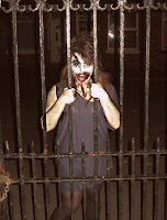
I felt that we used appropriate costumes, make-up and props for our film. For the zombies make-up we used white, grey, black and red face-paints. We painted their faces white to emphasize there paleness, and painted under their eyes with grey, then black (See image below). We then painted around the mouth with a deep red to give the impression that they had been feeding on human flesh. After making the fake blood we dripped it near and around the forehead  and mouth, to give a better impression of blood. We choose white t-shirts for each of our zombies as we thought that would best emphasize the blood and muck on their top. We splashed and printed our hands on the t-shirts to make them look more effective.
I thought that the location we chose was appropriate in setting the scene for a zombie film. We choose a graveyard which we thought was a likely setting for zombies. The grave stones created an eerie feeling and, the abandoned church was effective in creating a feeling of uneasiness as it towered over the graveyard. The trees in the grave yard surrounded the paths which built tension because it meant that the characters couldn't escape.
In my opinion i thought that the actors we choose were appropriate for our film, they delivered a good and believable performance when acting as a zombie or a civilian. 


* I edited this picture by changing the lighting, brightness and contrast.

For the planning of the film, i went shopping to collect the variety of different ingredients for the fake blood, face paints and to buy the T-shirts. I painted most of the zombies faces using brushes and sponges and decorated the zombies t-shirts with the fake blood. 
When filming i directed the characters into the right positions, so that it created enough lead and head room for when we was filming. I helped position the camera using the rule of thirds so that the shots looked more effective. For the editing process I helped split and crop the film so that we could achieve seamless editing and make sure that there was no jumps in-between each sequence. I helped with the transition affects, such as the fade out and the flash of the camera.
For improvements to the film i feel that we could have improved shots 6 & 7. We thought that there was a slight jump between that character taking the picture and the zombies. This could be improved by filming it differently, by shooting the picture being taken then the zombies in stead of him standing there for ages and then having to edit the shot later on.
When  filming for our final coursework i will check over the film to make sure that there is no continuity issues, as in this exercise in shot 5 only two character ran past the camera, when there should have been three.


Preliminary Exercise Evaluation - Charlotte Cox

Our final exercise proved that we could hold a steady shot as there was no unnecessary movement throughout our film which was due to the constant use of a tripod. I believe that our composition was quite good as the majority of our shots were framed correctly, such as the headroom and lead room. We constantly left enough room for the actors and actresses to move into and we made sure that they had enough space above their heads so that they weren't chopped off. However, if you take into consider other framing rules we could have filmed things slightly differently. For example, even though we continually used the nine square grid to make sure that we kept to the rule of thirds, in shot 4 the grave stone is perhaps too centered and could have been placed more towards the right, so the audience would naturally be drawn towards the empty space in which the actors would then run into. In our short sequence, we used a variety of shot types such as canted angles to film the grave stones to give an, distorted effect, high angles when the zombies were running towards the camera and low angles when they were running away from the camera. We also used long shots, close ups, POV shots and medium close ups. 


 In my opinion, we achieved seamless editing as we generally followed the 180 degrees line and 30 degrees rules, except for shot 6/7 in which we did not follow the 30 degrees rule for because we tried to achieve a POV shot to make it seem like the actor was taking a photo of the zombies at that precise time. We also used editing transitions such as fading the last scene to black to portray a bleak ending in which the zombies feasted upon the civillians. We also wanted to use a flash as an effect to make it clear that the actor was documenting the zombie attack with his camera, however it didn't seem right so we just extended the clip and chaged the colour to white, which I think gave the same effect and was a success . We also determined the lighting during our film, by adjusting the dark and light levels whic gave it an eerie atmosphere. Finally, we muted all noise as we believed that it increased suspense and in turn quickened the pace of the entire film.


I believe that we used appropriate costume as the tops were bloodstained and dirty however we only customized the tops as we didn't think that trousers were overly necessary to give the impression that they were zombies. In addition to the costume, I feel that the hair and make-up was also of a high standard. I believe that our location was brilliant, the graveyard definitely fit well with the zombie theme and made the whole scenario more realistic as it wasn't just grassy backgrounds and forestry. Lastly, our actors and actresses were great, they put their upmost effort into the acting and weren't bothered at all with the messy hair and make-up so I believe that our overall content was great.

During the process of the  exercise I directed the film and through the planning I helped gather the costume and make-up and on the final day joint made the actors and actress into zombies, who I think looked extremely realistic. I believe that all jobs within the group were equally distributed which is why we worked so well as a team, for exaple we all gave our input in directing by telling actors and actresses alike what to do/say/and where to stand etc. If we were to redo/improve the film I would propose the idea of reshooting certain shots becasue, although only myself and the other two people in the group realised it, we had one specific continuity issue which was that one of the civillian actors didn't run through one of the shots for some reason which proves that we hould also . I also think that we could reshoot scene 6 by filming the actor full on in the face so that the editing wouldn't seem as jumpy. When it comes to shooting the final coursework film, I think that we should especially take care when it comes to continuity to make sure we don't encounter the same problems when editing again, and try and achieve 'seamless editing'.


Preliminary Exercise Evaluation - Sophie Lowe

Our finished piece has shown that we can hold a steady shot, with the use of a tripod and that we can frame a shot appropriately, using the rule of thirds. 
We used a variety of shot types, for example we used canted angles at the start when we have the actors running past the gravestone. Also we used high angles when they were running away and the girl fell and we used a low angle when the zombies were coming towards the camera in the last scene. This was from the view of the people as the zombies were crowding around them. We made sure that when we were filming that in each scene there was enough head room for each character and that when they were running they had enough room to run into or if they were running off camera they were on for a reasonable about of time.

Each shot flows well, this is because we used a 180 degree line and made sure that we moved at-least 30 degrees everytime we filmed a new scene. This made sure that there were no jump shots. We tried to use a flash effect on the end of the clip where he takes a photo on his phone, however this did not end up working how we wanted it to work, so we created an extra clip and made it white and how long we wanted it and this created a flash between clips. Also the fade out at the end of the film worked really well when the zombies came towards the camera.

The costume and make-up worked really well for the genre of film we made. Although the zombies were not fully clothed as zombies they did have all dirty and bloody tops and all had great make-up and hair. You could tell that they were zombies. It was a fantastic location and setting for the genre we chose, because we could have the gravestones for extra effect rather than a lots of trees and grass. We did choose appropriate actors as they were not bothered about us putting make-up on them and messing their hair up. Also they were not afraid to look stupid while filming.

I think that when we were filming i did really well, by making sure that the camera was in the correct place using the rule of three and making sure that when the actors were on camera they were in the correct position and that there was enough head room. I think to improve, we could try and make the transition for shot 6 to shot 7 a bit better by having him move a bit more     in shot 7 and then take the photo rather than having him standing there straight away. I think that next time when I am filming I need to check that the continuity is right before we leave the location because when we go to importing the video we figured out that in one shot there are only two people running past when there should be three. Also that we checked where we are filming because at one point we found we were filming at the same place when they were running so we had to move.


Preliminary Exercise - Final Assessment

Thursday, 14 October 2010

Composition Exercise


For this exercise, we had to film a sequence of shots to portray the story of a person waiting for their friend, until their arrival, where they carry out a conversation before leaving together. On our first attempt the lighting was too bright therefore we were forced to reshoot.
On our second attempt we perfected the lighting and continuity issues (by means of making sure that when the friends left together they were on the same side throughout). I believe that although we didn't achieve 'seamless editing' in all of the shots, some transitions between clips were pretty smooth. Other things that I believe made our composition exercise successful were the headroom, lead room and rule of thirds.
When we were considering the headroom, we had to take into account that both of our actor's were of different heights which made it slightly trickier to make sure that we had both of them in the shot without chopping off their heads but without giving too much space(which would draw attention away from the conversation), but we feel we achieved this perfectly.
When we looked back upon our film as we got to the editing stage we noticed that in a couple of shots, it looked like there was too much lead room which couldn't be helped because we were panning the actor walking into the scene and back out again.
Finally, with regards to the rule of thirds, we believe that we achieved this successfully as we always made sure that the characters weren't situated in the middle of the screen, they were slightly towards the right or left, looking towards the middle and away from the camera.

Assessment Exercise


This is the film that we chose to recreate the first 40 seconds of.


This is the shot list for the 40 seconds we have selected.

Wednesday, 13 October 2010

Character Design - ZOMBIE Shot 1


Shot 1  Before Zombie Makeover


Shot 2 During the Makeover Process

Shot 3 Final Outcome. Makeover complete


Shot 4 Scene1: The Zombie Escapes

Shot 5 Scene 2: Zombie on the Prowl
    
              Shot 6 Scene 3: Zombie Finds
PREY


Shot 7 Scene 4: Dinner Time!!!


*We edited the pictures by changing the lighting and contrast.

Thursday, 7 October 2010

Evaluation: Continuity Exercise 2nd Attempt


For the second attempt, compared to the first video we made i believe that this one was mores seamless between each shot, however it was not perfect. For most of my shots i feel i have correctly filmed each one. But i felt like the close up of the watch could have been a bit more focused and shot more directly above to give the impression of the character looking at the watch. I have included the number of shots that i intended and felt that the video had more pace and atmosphere than the first. I felt that the video we created could have been improved by making sure the shots we filmed correctly and that when filming a different scene we moved the camera more the 30 degrees so it doesn't create a jump shot.


Evaluation: Continuity Exercise


For this exercise i had to edit it by myself.
I don't think i have achieved 'seamless editing' I feel in some shots the camera jumps from one scene to the next, creating a feeling of uneasiness. I feel i have framed my shots correctly according to the sheet, when trying to create the variety of different shots like the close up on the feet, marching up the stairs. However when i did a close up of the watch it was slightly out of focus. I have included the number of shots that i intended, and i feel that my piece has some pace and atmosphere. I feel that it could be improved by making the shots more smooth as they move from one scene to another. Also to make sure that the close ups are in focus to make it clear.

Thursday, 30 September 2010

Charlotte And Jake


  • We  believe that our scenes were framed correctly however on some, too much space was included but this couldn't be avoided as there was a stand off between the two gunmen, and we wanted to include a two shot.
  • We included all of the shots and techniques we wished to include in our short film, such as extreme close up, long shot, two shot, over the shoulder (POV) close up, hight to low angle, panning and a mid shot. However, we wanted to include a canted angle but the actors we used were unwilling to take part therefore we had improvise with a different ending, which did not have the same effect.
  • We think that our short sequence of clips had pace, especially when one of the gunmen was walking towards the other, and we used pannning from a high to low angle which made the woman seem powerful, intimidating and in control. A frosty atmosphere was created at the begginning of the film, when the scene was established, and one gunman instigated the mock gun fight.
  • If we were set more time we would've included multiple sound effects such as; footsteps; tumbleweeds and bullets being fired; background lighting changes to make it seem like a western film and fading transitions between clips, accompanied by wild west pieces of music.
  • We believe that overall, our movie did flow from one clip to another which was a bonus as we feared that the clips would look randomized but instead, they clearly told the story well.