Monday, 28 February 2011

3. Who would be the audience for your media product?

During research for our horror film I came across some user ratings on http://www.imdb.com/title/tt0363547/ratings for the 2004 Dawn of the Dead remake- a film which primarily inspired our opening credits.

As the bar chart above shows, the category that on average gave the highest rating was The under 18's, predominantly male under 18'sWe predict that this category like horror films in particular due to the content of blood, gore, violence etc which stereotypically would appeal to a more youthful and masculine age/gender group. Due to this demand from the male under 18 category we decided upon incorporating all these things somehow in our film opening. We thought we would include a threat and hint at some violence (the death of the victim) whilst not showing it as it is only a 15 certificate and we didn't want to reveal too much as it is only supposed to be the first 5 minute introduction to a horror film opening. We also included the 'bloodied hand' which unintentionally looked not dissimilar to the hand emerging from the ground in the image to the left. The only difference is that the fingers were also straightened and it was covered in blood instead of dirt, and is was banged against a window pane.
Deciding a primary target audience of under 18's this is why we decided to cast actors under 18, so that our target audience could to some extent relate to the characters/actors. This decision was reinforced after we pitched our film to fellow classmates (of the same age as us -16/17) and they said that it appealed to them and our feedback sheet commented on how we had a "clear target of audience is identified".
Having a target audience of under 18's consequently made our certificate 15.If a film has been given a 15 certificate by the BBFC (British Board of Film Classification), this means that people only aged 15 or over can watch the film.
However, just because our target audience will be predominantly males (shortly followed by females which is our secondary target audience) under 18's doesn't mean that our content should only cater for the under 18 age range.  We noted from Dawn of the Dead's user rating bar chart that the film was still quite highly rated up until the 30-44 age group. This is when we decided that we would play on a fear of older audiences whilst still letting younger audiences feeling like they can relate to the cast, and we will do this by casting younger actors and actresses and give them the role of zombies, which will portray today's adolescent "ASBOs". This will hopefully exploit older audiences' fears of teenagers of today as they are generally seen as a threat to society.
As seen in the image above, all 4 of our actresses are of a similar age, which like I stated previously, can hopefully mean our primary audience (16-19) can relate to them and our older audiences (30-44) can hope to feel threatened and intimidated by the feral looking zombies on the left.


Saturday, 26 February 2011

2. Forms and Conventions


The typical forms and conventions of a zombie horror film are:

Zombies are usually depicted as mindless decaying corpses usually with a hunger for human flesh or brains, however in recent films such as dawn of the dead and 28 days later, the films that inspired our zombie horror, zombies have increased agility.

 Zombies are typically pale and dirty reflecting there death like state and decaying bodies. They're usually covered in blood, around the mouth from were they have eaten human flesh or from injuries from unsuspected victims. 


We have used images from the dawn of the dead to create our zombie in our film, by using fake blood and make up. When editing we will darken some scenes to create suspense and make it more frightening. In the picture above you can see the blood stains around the zombie mouths, and the pale skin, we also added black and red on the teeth to make the zombies teeth more dirty 

The research we have acquired is important because it has enabled us to apply the stereotypically characteristics of a zombie horror into our film. Such as the design of our zombie. Making it more effective as a zombie horror.

Our film production will develop typical forms and conventions as we make a typical zombie horror film. We reinforce the typical convention of a zombie horror film as we have added a slow mindless zombie and, the victim in the horror film if a yound female that is all alone in the dark while a zombie waits for her outside.


In our film we used a variety of different shots, using research to us to develop an array of different scenes to portray a typical zombie film.


In our film we applied a similar scene/shot to create dramatic irony. In this shot we can see a zombie in the background without the character in the foreground knowing. Adding a shot like this in our film will hopefully leave the audience feeling uneasy, as they know that the character is in danger but the character themselves don't. This will leave the audience gripped to their seats anticipating what will happen next. The use of a long/mid-shot will enable to the audience  to see the characters facial expressions and body language so that when something happens to the character the audience will have more of a reaction to what happens. This will reinforce forms and conventions of a horror film, as you would expect the threat to be hidden. Silent but deadly.

Alice our main character reinforces typical forms and conventions of a horror film, stereotypically depicted as a young, vulnerable girl all alone in a house that is supposed to be "safe".


Our zombie character, challenges typical forms and conventions. Our zombie is a small young teenage girl that otherwise would have appeared to be quite harmless. We thought this would be effective as you wouldn't expect a young girl to be that dangerous shocking the audience when the story unfolds.


The average joe house, reinforces forms and conventions, being a stereotypical house that at the end of the day is supposed to keep you safe. When something happens and the character is no longer safe, it will hopefully leave the audience on the corner of there seats and out of there comfort zone.


This images shows inside the house.

Overall i feel that the performance of the acting was very good. Our main character reinforced typical forms and conventions as she portrayed a vulnerable teenage effectively, giving a believable performance that made the audience feel that she was generally terrified by the threat. She illustrated who emotion through facial expressions effectively reacting to the different scenes horror.

The music we used in our film also reinforces the typical forms and convention of a horror film. We built the music up using, strings and then abruptly muted the sound at the point where something scary was going to happen. Increasing the ambient sounds such as breathing and footsteps, and then finally increasing the sound where there would be a bang or a scream, increasing suspense and therefore scarring the audience even more.


1. Introduction

For our horror film we are going to make a zombie horror. We have carried out lots of research, we have used the Internet to investigate our target audience and the distinctive characteristics of a typical zombie horror film.* we have applied this research to the making of our zombie film, for example, casting teenagers, after research we came to the conclusion that our target audience would be people under the age of 18.

Re-occurring characteristics of typical zombie horror film:

  The colour RED seems to be a re-occurring colour in zombie horrors, as it is associated with blood, gore, rage and anger.

The colour BLACK also seems to be a re-occurring colour, this make the red stand out and appear more vivid, the colour black also creates a sense of foreboding.

28 Week Later Trailer:


In this film trailer they use dark colour such as black and darken images to create a more omnious scene, making it more effcetive as a horror film.


This is another image from dawn of the dead that shows the dominating colours of red and black. These recurring colors that stand out draw the audience in making the scene/images more scary when something horrific happens. Also these colors help identify the genre of film, as the colours black and red create an eerie atmosphere when used correctly.

We want these to be the dominating colors in our horror film to increase suspense and the effectiveness of our zombie horror.

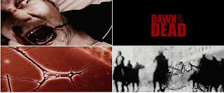
Our inspiration came from the film dawn of the dead, we thought the flashing images in the beginning of the film were very effective in grabbing the audiences attention, so we thought we would incorporate something similar in our opening sequence, to have the same effect.


Images from dawn of the dead:

In the beginning they use a variety of different shots, all dominated with the colour black , making it more appropriate for a horror film.

Images from our film, Death Walkers:

In our film we have also used  variety of images, a crow, we thought would be effective as it can symbolize death and looks quite mysterious. Noise, and what appears to be broken screen, showing that you might not be able to contact the outside world, and finally someone being dragged out the home, suggesting that nobody is safe.

Overall the production of our zombie film has worked out. In the group was Jake Stephenson and Charlotte Cox. I think that when working together we were a good team and very effective, in getting the work done and planning for our film. During the planning and making of our zombie film we didn't come across any problems, we split work equally so not one of us had to do more work than the other. However when we first filmed the lighting was wrong, when editing everything became to dark and you were unable to see anything properly. To overcome this hurdle we re-arranged to film another day were we took out more torches and placed more lights around the room so that we were able to get the correct lighting.


Throughout the making of our film, we were constantly aware of each other skills. Making it much easier for us to share and split work easily so that not one of us was doing much or to little work. For example, one of us is artistic so so they did the story board, and another is more literate so they  did more writing based tasks. We also knew each other previously so it was much easier to work together as we had good communication within the group.


Thursday, 3 February 2011

Planning

Date: Saturday 6th February


Cast and Crew:


Alice Davis
Kimberly MacGalloway
Janay Gibson
Amber Hutchinson
Calum Swinn
Billy Highton
(June York)


Times:


Janay Gibson, 15:15


Calum and Billy, 15:30


Lauren Sutherland, 16:30


Kimberly and Alice, 17:00


(colour corresponds to the part each actor is playing)


Script
EXT. VERNON PARK – NIGHT
NARRATOR V.O
During those days men will seek death, but will not find it; they will long to die but death will elude them.

ZOMBIE#1
ZOMBIE#1 BANGS AGAINST PARK RAILINGS ACCOMPANIED BY HIGH PITCHED SCREAMING AND SHOUTING.
FLASH OF BLACKNESS

EXT. VERNON PARK – NIGHT
ZOMBIE#1
ZOMBIE#1 ZOOMED IN UPON FACIAL AREAS. SCREAMS AND HEAVY BREATHING CAN STILL BE HEARD.
FLASH OF BLACKNESS

INT. CIVILLIAN’S HOUSE – STAIRWAY – MIDDAY
CIVILLIAN#1 AND ZOMBIE#2
CIVILLIAN#1 SCRAMBLES UPON THE STAIRCASE WITH A CAMCORDER IN HAND FROM THE CAMERAS POINT OF VIEW. SHER SCREAMS, STUMBLES AND THE CAMCORDER FLYS OUT OF HER HAND AND OUT OF REACH. CAMERA THEN SHOWS CIVILLIAN#1 DRAGGED DOWNSTAIRS BY ZOMBIE#2.
FLASH OF BLACKNESS
EXT. NAVENBY – FRASER STREET – PAVEMENT
ZOMBIE#3 AND CIVILLIAN#2 AND CIVILLIAN#3
ZOMBIE#3 IS BEING HELD DOWN BY TWO UNNAMED INDIVIDUALS AS HE ENTERS THE ZOMBIE TRANSFORMATION.
FLASH OF BLACKNESS
INT. 10 DOWNING STREET – PRIMEMINISTER’S HEADQUARTER’S
PRIMEMINISTER AND JOURNALIST (O.C.)
JOURNALIST’S FLASH OF CAMERA LIGHTS IN THE CONFERENCE ABOUT THE ZOMBIE VIRUS EPIDEMIC

                  JOURNALIST (O.C)
Prime minister, do you know what these creatures are?
PRIMEMINISTER
I don’t know.
FLASH OF BLACKNESS
ENTER TITLE
FADE INTO NEXT SCENE

INT. DAVIES HOUSE – ALICE’S LIVING ROOM – EVENING
ALICE AND ZOMBIE#3
A YOUNG, VULNERABLE 16 YEAR OLD GIRL IS ALONE WATCHING TV AT NIGHT WHEN SUDDENLY THE TV FLICKERS, ALONG WITH THE LIGHT WHEN A LOUD NOISE OCCURS OUT OF NOWHERE. ASSUMING SOMEONE IS AT THE KITCHEN WINDOW, ALICE MAKES HER WAY OVER TO IT AND PERCHES HERSELF UPON THE KITCHEN COUNTER, BEFORE SCOURING THE GARDEN THROUGH THE WINDOW. AS SHE DOES THIS A HAND BANGS AGAINST THE WINDOW PANE AND STARTLES HER. THINKING IT’S AN INJURED PERSON SHE SCRAMBLES IN THE DRAWERS, SEARCHING FOR A TORCH TO USE AS A LIGHT SOURCE SO SHE CAN GO OUTSIDE AND HELP THE ‘INNOCENT CIVILLIAN’(AS THE OUTSIDE LIGHT DOES NOT WORK). AS SOON AS ALICE FINDS THE TORCH SHE RUNS TOWARDS THE DOOR AND OPENS IT, HEADING STRAIGHT FOR OUTSIDE. WITH IT BEING TOTAL BLACKNESS SHE TURNS ON THE TORCH AND SCANS THE GARDEN LOOKING FOR THE MYSTERIOUS FIGURE SHE ASSUMES TO BE HURT WHEN THE DOOR BEHIND HER CLOSES WITH AN ALMIGHTY FORCE WHICH CAUSES HER TO BE SCARED AND IN RETURN DROP THE TORCH. AS ALICE IS NOW IN BLACKNESS SHE PROCEEDS TO PICK IT UP AND AS SHE STANDS UP AND TURNS TO SEARCH FOR THE VICTIM AGAIN, THE ‘MYSTERIOUS FIGURE’ TURNS OUT TO BE A ZOMBIE AND IS  STANDING FACE TO FACE TO HER. AS ALICE SCREAMS, THE FILM FINISHES ON A CLIFFHANGER.
SCENE FADES TO BLACK

What we plan to take out:

Camera
Tripod
Torch
Lights
Filters
Halogen Flood Light